Volcanoplot#
Differential expression analyses frequently require a volcanoplot showing significance against fold-changes in order to pick out regulated features. Importantly, a volcanoplot is not so much a standalone kind of plot but a collection of several basic plotting elements, combined into a visual “mini-analysis” to identify significantly regulated hits. alphapepttools.pl.volcano summarizes several basic building blocks to abstract the following functionalities:
scatterplot
adding lines to the scatterplot
adding anchored labels to the scatterplot
adding axis labels (this is debatable, maybe we could keep this external)
adding a legend
setting plot x/y limits
%load_ext autoreload
%autoreload 2

import pandas as pd
import numpy as np

import alphapepttools as apt
Generate a small example dataset#
We generate a small example dataset meant to resemble a typical differential expression outcome.
# Set up reproducible random number generation
rng = np.random.default_rng(seed=42)

# example data, should be replaced by actual differential expression results from example file
testx = rng.normal(0, 1, 300)
testy = -np.cos(testx) + rng.normal(0, 0.2, 300)
testp = 10 ** -(testy - min(testy))
vp_data = pd.DataFrame(
    {
        "id": [f"P{10000 + i}" for i in range(300)],
        "gene": [f"gene_{i}" for i in range(300)],
        "log2fc": testx,
        "pval": testp,
        "neg_log10pval": -np.log10(testp),
    }
)
vp_data.index = vp_data["id"].astype(str)

# Simulate differential expression annotation
vp_data["diff_exp_status"] = vp_data["log2fc"].apply(
    lambda x: "upregulated" if x > 1 else ("downregulated" if x < -1 else "unchanged")
)

# Suppose the first 10 genes are proteins of interest
vp_data["label"] = "other"
vp_data.loc[vp_data.index[:10], "label"] = "POI"
Basic volcanoplot#
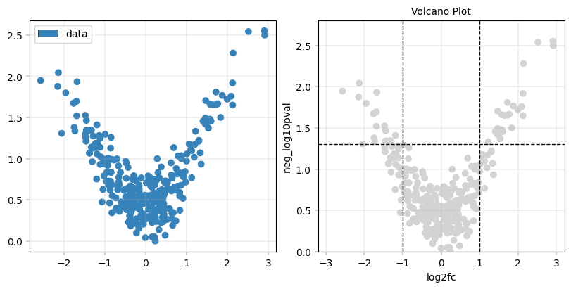
At its core, the volcano() function is a convenience wrapper around scatter(), with a special focus on layered data annotation. This is obvious when we can call the function with the bare minimum of parameters next to the basic scatterplot:
from alphapepttools import pl

# As usual, we start with a figure and an axis manager that allows us to easily traverse subplots
fig, axm = pl.create_figure(1, 2, figsize=(8, 4))

# Scatterplot
apt.pl.scatter(
    ax=axm.next(),
    data=vp_data,
    x_column="log2fc",
    y_column="neg_log10pval",
    default_group="data",
    legend="auto",
)

# Volcanoplot, with some defaults for title, lines and labels
apt.pl.volcano(
    ax=axm.next(),
    data=vp_data,
    x_column="log2fc",
    y_column="neg_log10pval",
    default_group="data",
    legend="auto",
)
Advanced layering in a volcanoplot#
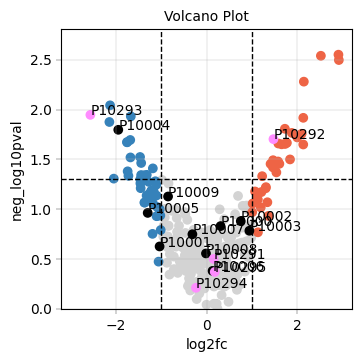
The volcanoplot makes use of alphapepttools’ capability for layered visualizations and summarizes some convenient plot elements into a single wrapper function.
For example, given this plot_layers definition, we specify that we want to plot proteins of interest with a specific hypothesis attached above proteins belonging to the ‘POI’ category in general, below which up/down/and non-regulated points should be shown:
pois = ["P10291", "P10292", "P10293", "P10294", "P10295"]
plot_layers = [
    # look for all points in the "id" column that are in the pois list and color them according to the "POI_hypothesis" color in the color_dict
    ("id", pois, "POI_hypothesis"),
    # look for all points that have "POI" in the "label" column and color them according to the "POI" color in the color_dict
    ("label", "POI", "POI"),  # in the second layer, plot all points where the label is "POI"
    # similar for regulation status
    ("diff_exp_status", "upregulated", "upregulated"),
    ("diff_exp_status", "downregulated", "downregulated"),
    ("diff_exp_status", "unchanged", "unchanged"),
]
We need a color_dict which specify how to color each layer:
color_dict = {
    "upregulated": apt.pl.BaseColors.get("orange"),  # the specific point "P10001" should be colored orange
    "downregulated": apt.pl.BaseColors.get("blue"),  # the specific point "P10002" should be colored blue
    "unchanged": apt.pl.BaseColors.get(
        "grey"
    ),  # points from the list ["P10002", "P10003", "P10004"] should be colored grey
    "POI": "black",  # points where the label is "POI" should be colored black
    "POI_hypothesis": apt.pl.BaseColors.get("purple", lighten=0.7),  # points in the pois list should be colored purple
}
Additionally, we specify which points to add labels to by referencing their key in color_dict:
label_layers = [
    "POI",  # label all points where the label is "POI"
    "POI_hypothesis",  # label all points in the pois list
]
Essentially,#
we create a volcanoplot that’s saying “put regulated points in the background, highlight POIs in black and special hypothesis POIs in purple on top. Additionally, add labels only to the first two layers.”
Generating the volcanoplot with labels#
apt.pl.volcano(
    data=vp_data,
    x_column="log2fc",
    y_column="neg_log10pval",
    color_dict=color_dict,
    layers=plot_layers,
    label_layers=label_layers,
)
However, direct labelling is sub-optimal…#
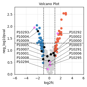
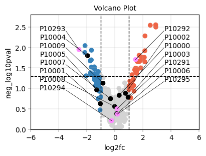
While this achieves the plotting per se, overlapping labels are illegible and dodge/jitter solutions often produce scattered-looking plots that don’t scale down well. We address this by resorting to anchored stacked labels, where we specify a number of x-axis anchors above which labels should be stacked vertically. This makes the plot much tidier, allows for clean labelling of more points and makes it very easy to scale down a plot to adapt to limited publication figure real estate.
Generate volcanoplot with anchored stacked labels#
apt.pl.volcano(
    data=vp_data,
    x_column="log2fc",
    y_column="neg_log10pval",
    color_dict=color_dict,
    layers=plot_layers,
    label_layers=label_layers,
    x_label_anchors=[-3.5, 3.5],  # Put label columns in these positions (nearest points are assigned to either one)
    y_padding_factor=1.7,  # How much vertical space to add between labels
    y_display_start=0.75,  # Where to start the top label display (0 = bottom, 1 = top)
    xlims=(-6, 6),
)
Scaling down the volcanoplot to fit in a single paper figure tile#
fig, axm = pl.create_figure(1, 1, figsize=(4, 3))

apt.pl.volcano(
    ax=axm.next(),
    data=vp_data,
    x_column="log2fc",
    y_column="neg_log10pval",
    color_dict=color_dict,
    layers=plot_layers,
    label_layers=label_layers,
    x_label_anchors=[-3.5, 3.5],  # Put label columns in these positions (nearest points are assigned to either one)
    y_padding_factor=1.7,  # How much vertical space to add between labels
    y_display_start=1,  # Where to start the top label display (0 = bottom, 1 = top)
    xlims=(-6, 6),
)
Summary:#
alphapepttoolsallows for generating volcanoplots with flexible coloring and labeling.anchored stacked labels allow for more organized, smaller scatterapt.pl.
The underlying function
pl.layered_plotcan be used to generate layered plots in a generalized way (described in the notebooktutorials/tutorial_02_basic_plotting_workflow.iypnb).